Usability Design of Tractor In-Cab Display

Role:
UX Researcher | UX Designer
Duration:
7 Weeks
Research Approach:
Mixed-Methods
Techniques Used:
Structured & Semi-Structured Interview, Task Analysis, Affinity Map, Heuristic Evaluation, Moderated Testing, T-Test
Data Collected:
Task Workload using NASA TLX, Task Completion Time, Number of User Clicks, Satisfaction Metric (5-point scale)
Tools Used:
Figma, Miro, iPad, Google Forms, John Deere's 4640 CommandCenter simulator
Team:
5
Project Type:
500-Level Graduate Course Project - Design and Evaluation of Human Computer Interaction
Key Metric:
75% decrease in frustration
41% decrease in mental demand to complete a task
44% decrease in time-based pressure to complete a task
Too Long? Here's What I Did:
I facilitated two contextual inquiry sessions; coding themes from participant conversations; sketching and prototyping; moderated usability testing sessions; quantitative data collection and facilitated analysis; established rapport with participants
I created UML diagrams and think I'm a good note-taker!
How It Began
More than 70% of Iowa's land is farmed. I live in Ames city, surrounded by vast swathes of farmland. The focus area was the usability and experience of using John Deere tractor's In-Cab Display. The integrated In-Cab Display is a powerful control system designed to streamline farming operations. It provides farmers with real-time data and control over essential functions such as GPS guidance, machine diagnostics, seed planting rates, and harvesting performance.
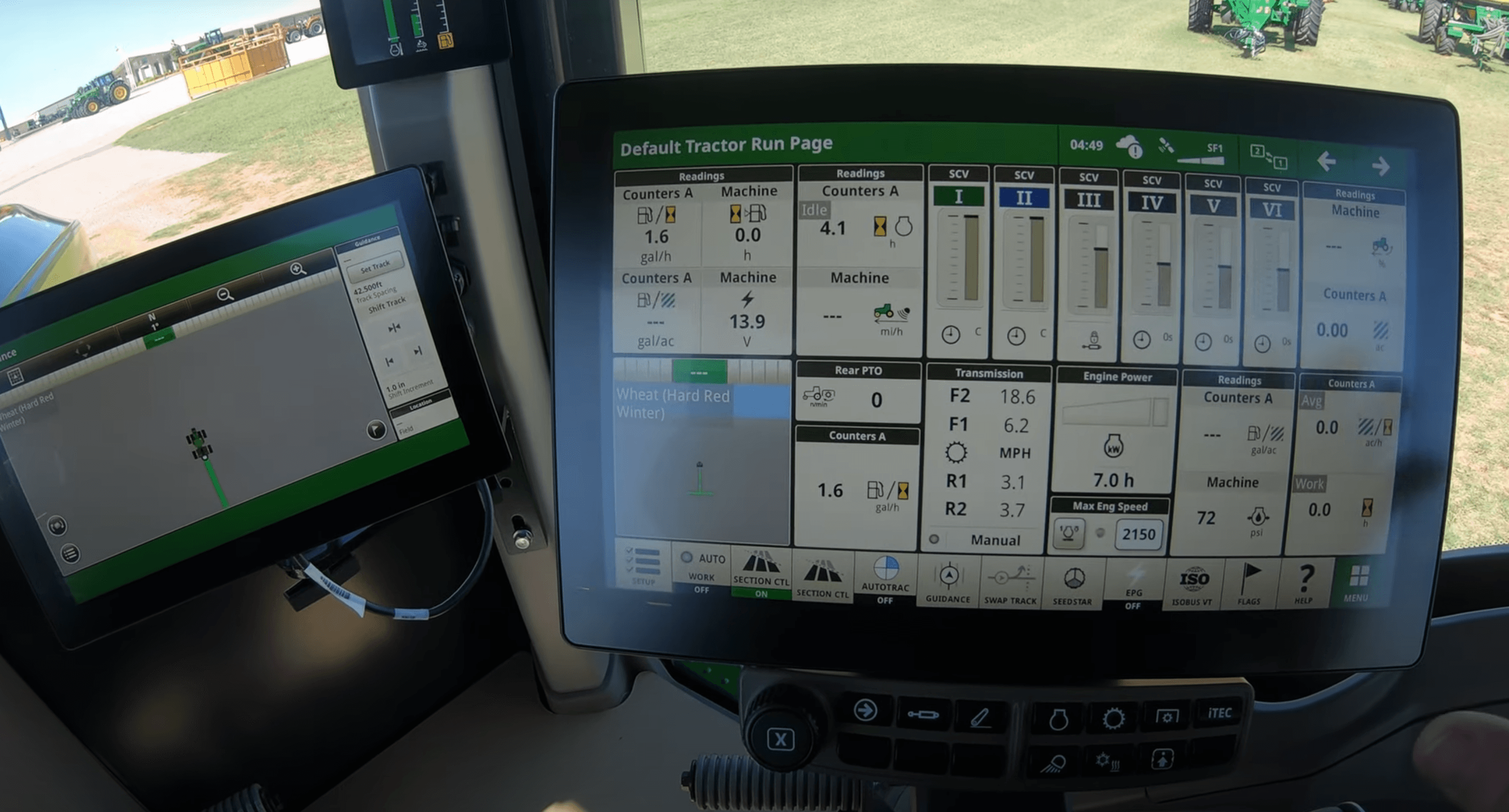
To learn about the functions and controls of In-Cab displays, we used the 4640 CommandCenter display simulator available on John Deere's website.
Who Are We?
My team consisted of:
A software developer
A mechanical engineer
A civil engineer
An HCI professional
Our Focus Area
Given the project timeline, we defined the scope to focus on two key areas:
Setting up the homepage interface
Help Center redesign
What is homepage?
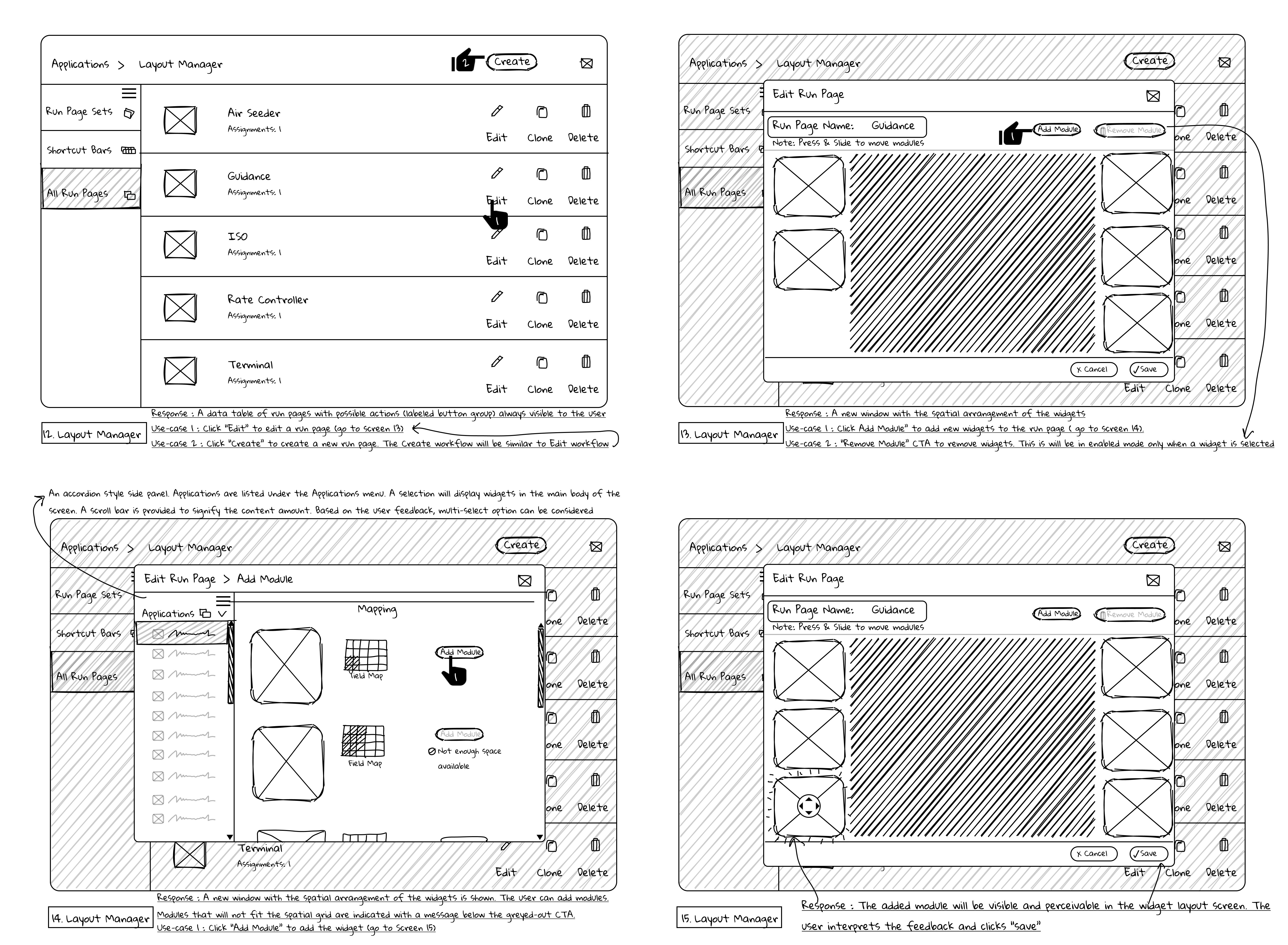
The homepage, or 'Run Page' as it is called, is a series of pages with widgets that control various electrical and mechanical components of the tractor.
What is Help Center?
The Help Center is the one-stop guide for controls. The interface shown in the video is the existing John Deere design.
Starting with Content Analysis
To begin with, we conducted content analysis by scouring the Help document in John Deere's In-Cab Display. While the Help document was extensive, it was exhausting to learn the functions. I felt cognitively burdened by the wall of text and repeated clicks. Additionally, completing tasks and reversing actions in setting up the homepage interface required 12 to 15 clicks, leading to navigation fatigue.
I created a task model using Hierarchical Task Analysis (HTA) and a data glossary to decompose the existing information.
What We Believed Was Needed
Once we had a bird's-eye view of the system and its functions, the goal was to understand the user's perspective, identify perceived complexity, and uncover usability issues. We focused on the following usability principles:
Learnability
Minimizing memory load
Error Prevention
Consistency
What Users Needed
Initial Interview
We recruited 5 participants for the initial interview. Before the interview, participants were surveyed on usability (scale of 1 - 5), frequency of display usage while operating on a farm (descriptive), and average interface usage (measured in hours).
Contextual Inquiry
We conducted contextual inquiry sessions with 5 participants in their environment, where they walked us through the existing interface workflow. During these sessions, we identified 3 tasks and had participants walk through the user flow, eliciting their responses. The tasks were:
Customizing the homepage interface (tractor control center)
Adding equipment to the tractor via equipment manager menu
Assessing the learnability of a function using help menu
Revealing Patterns
"The customization of the homepage and widgets is four layers deep," said one participant
I recorded all notes and quotes in my diary, and created an affinity map on Miro. The pain points were siloed and interlinked based on impact and dependency.
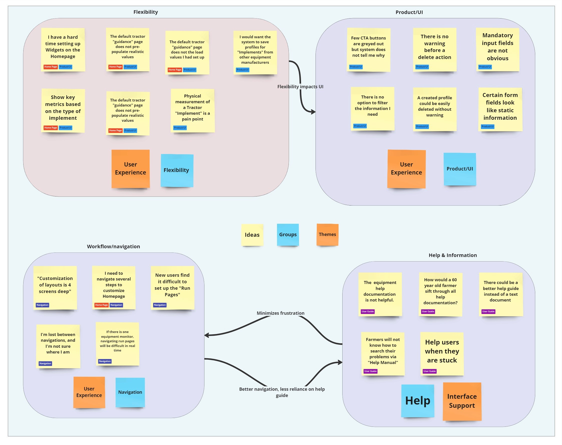
By coding each participant's responses, we identified the need for easier customization of the homepage interface, a more usable and useful help document flow, and a reduction in interface clicks — essential for operating the machine on a farm.
Personas
"Interface Navigation is the hardest thing..how would you expect a 60 year old farmer to figure all this out?" the participant lamented..
Two user personas were identified. Although each persona rated the system usability differently, their frustrations were similar. One participant explained that, while they are familiar with the system, it can still be daunting — especially for someone new.
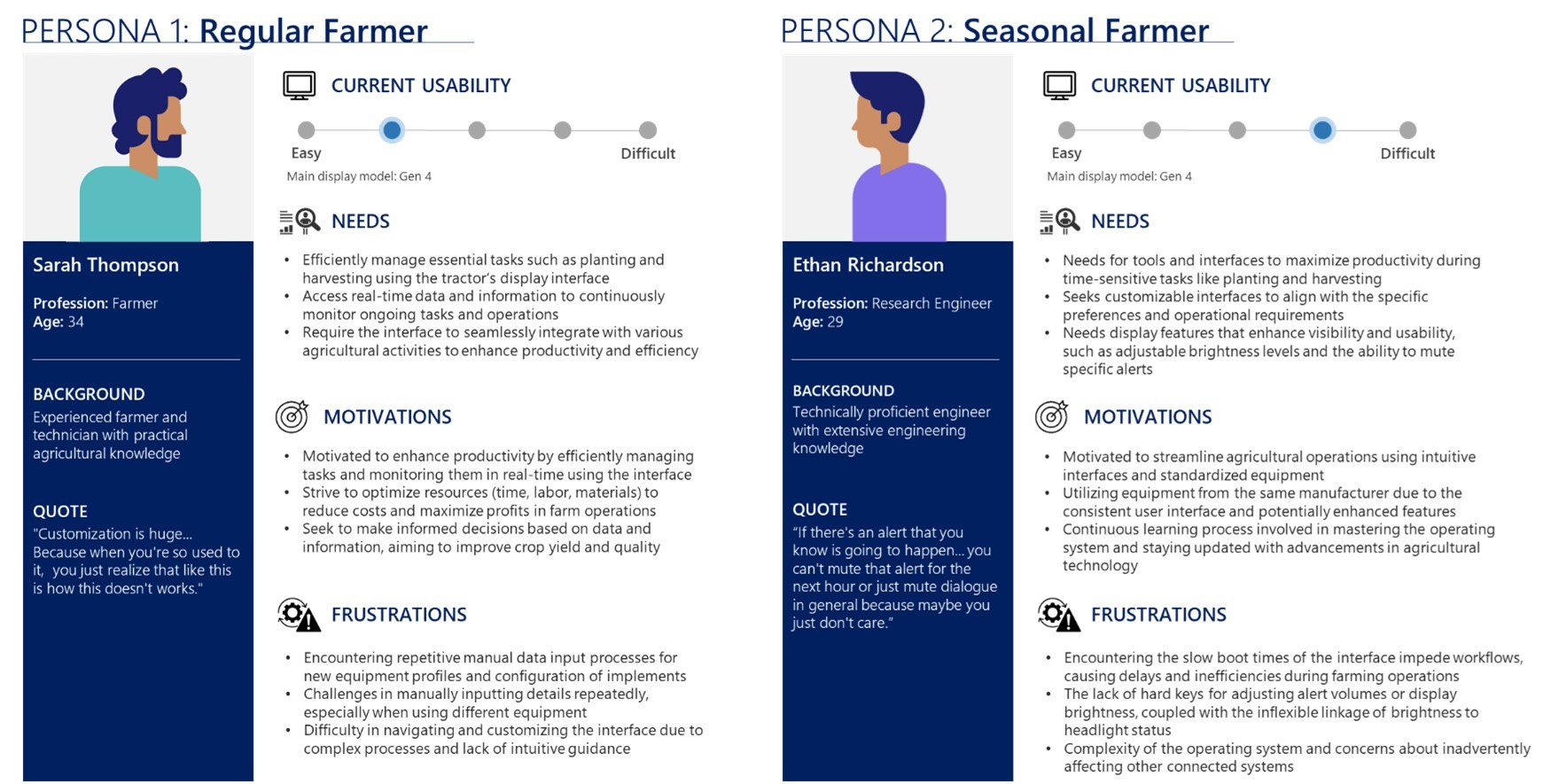
Personas were developed by a teammate and validated by the rest of the team.
Why Homepage & Help Center?
From the interview scripts and analysis, we discovered that ease of homepage customization is essential, as the layout and widget types vary based on the type of machine—harvester, tractor, seeder, etc.
Learnability of functions through the Help Center is necessary to minimize cognitive stress for users of all age groups.
Synthesis & Sketches
I created a few sketches for customizing the homepage interface, while my teammates worked on sketches for the help menu, the workflow for adding equipment, and the field map.
To validate and simplify the flow, I created an activity diagram for setting up the homepage interface. This process helped us redefine the spatial mapping of UI elements based on their functions and guided the development of our sketches.
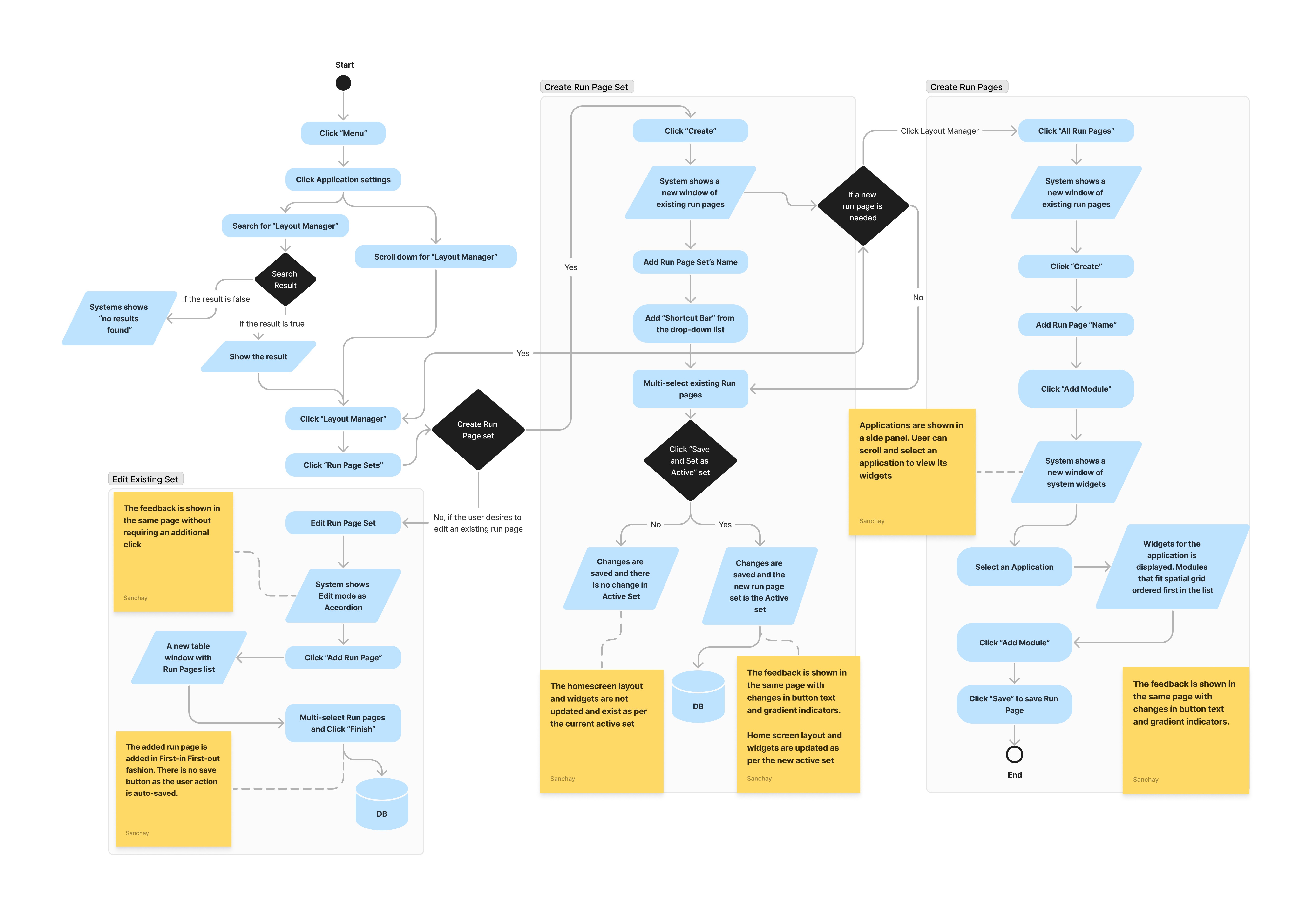
Workflow for customizing the homepage
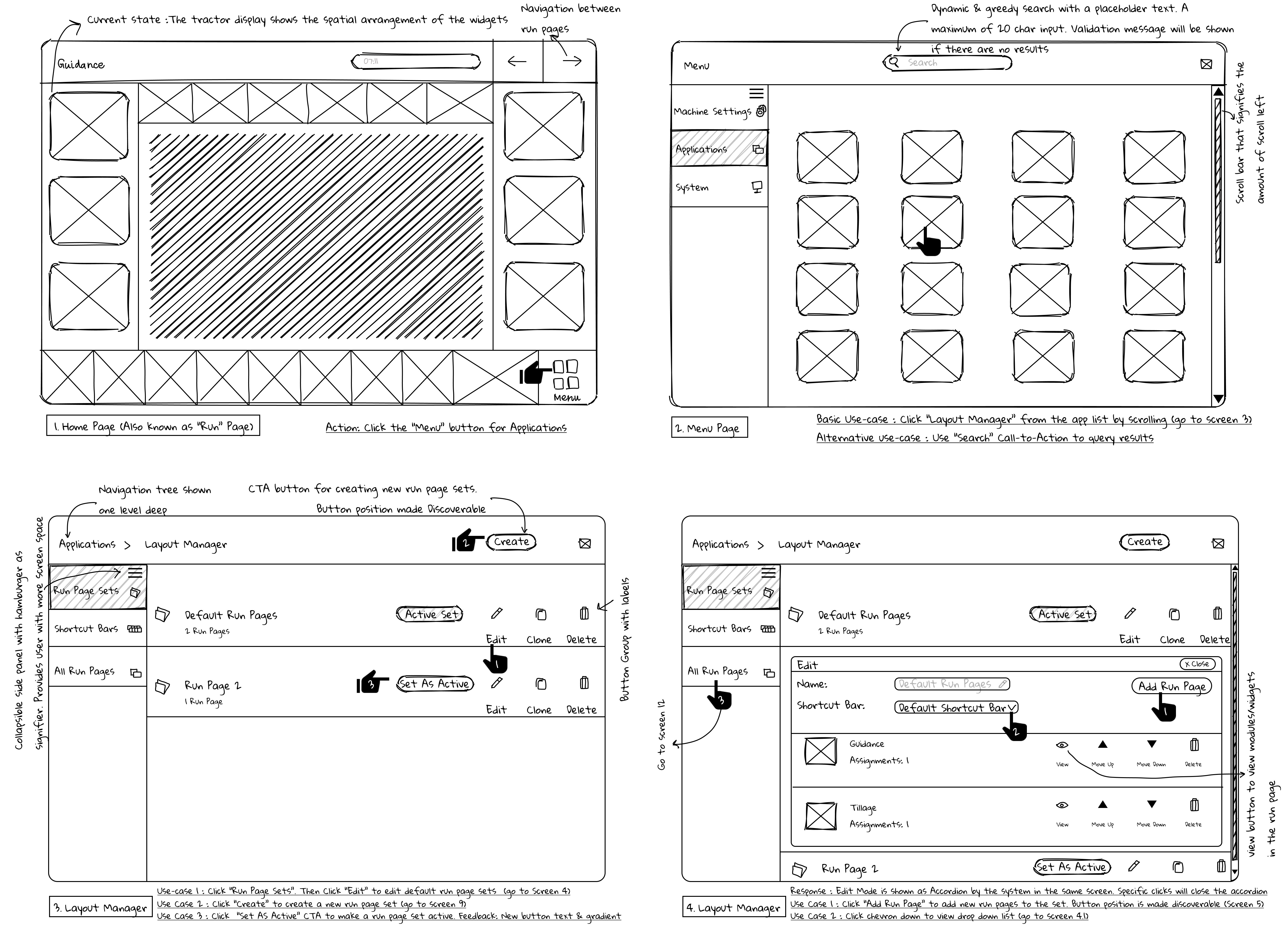
Choosing pages to be shown on the homepage
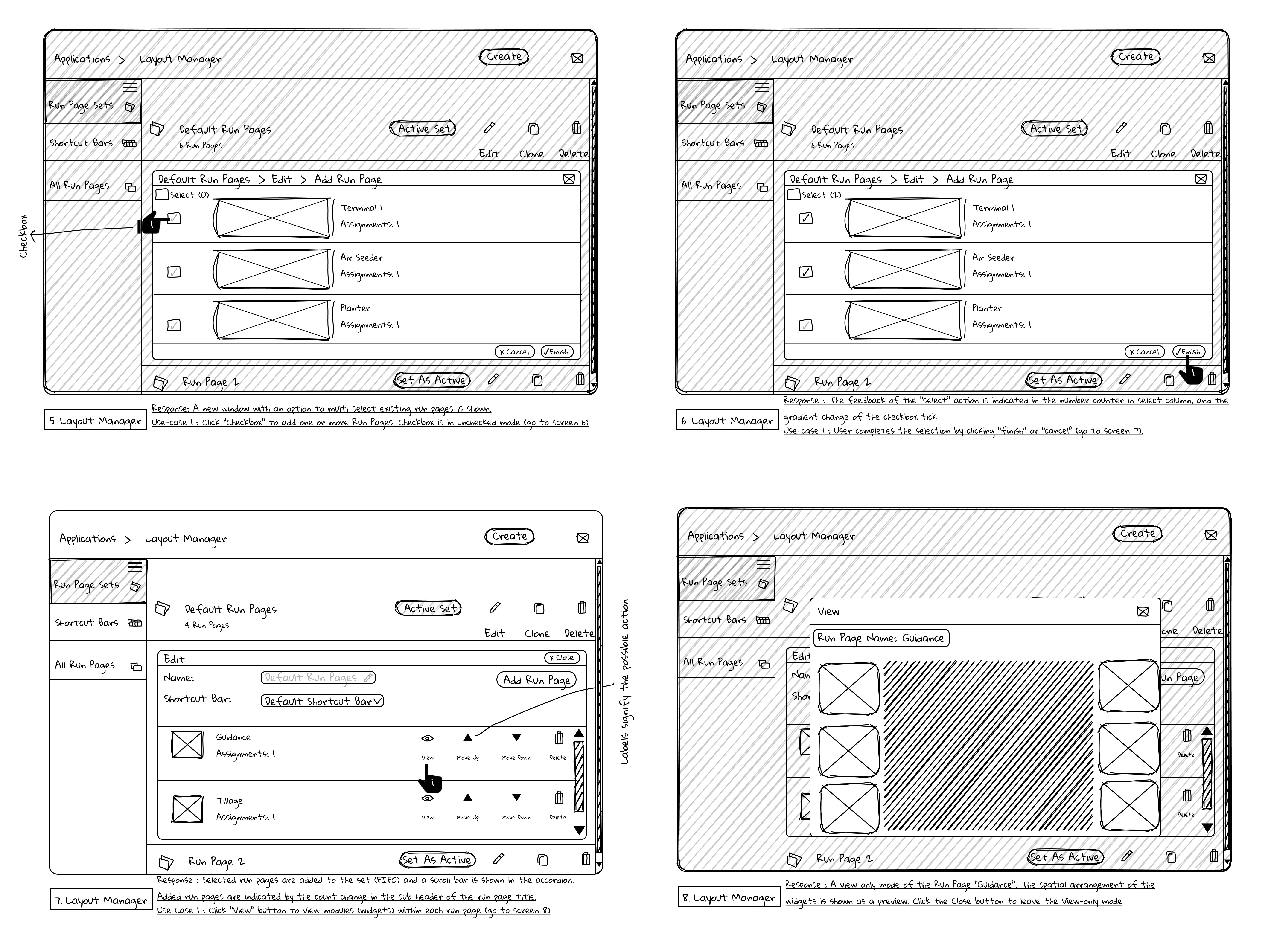
Updating the homepage
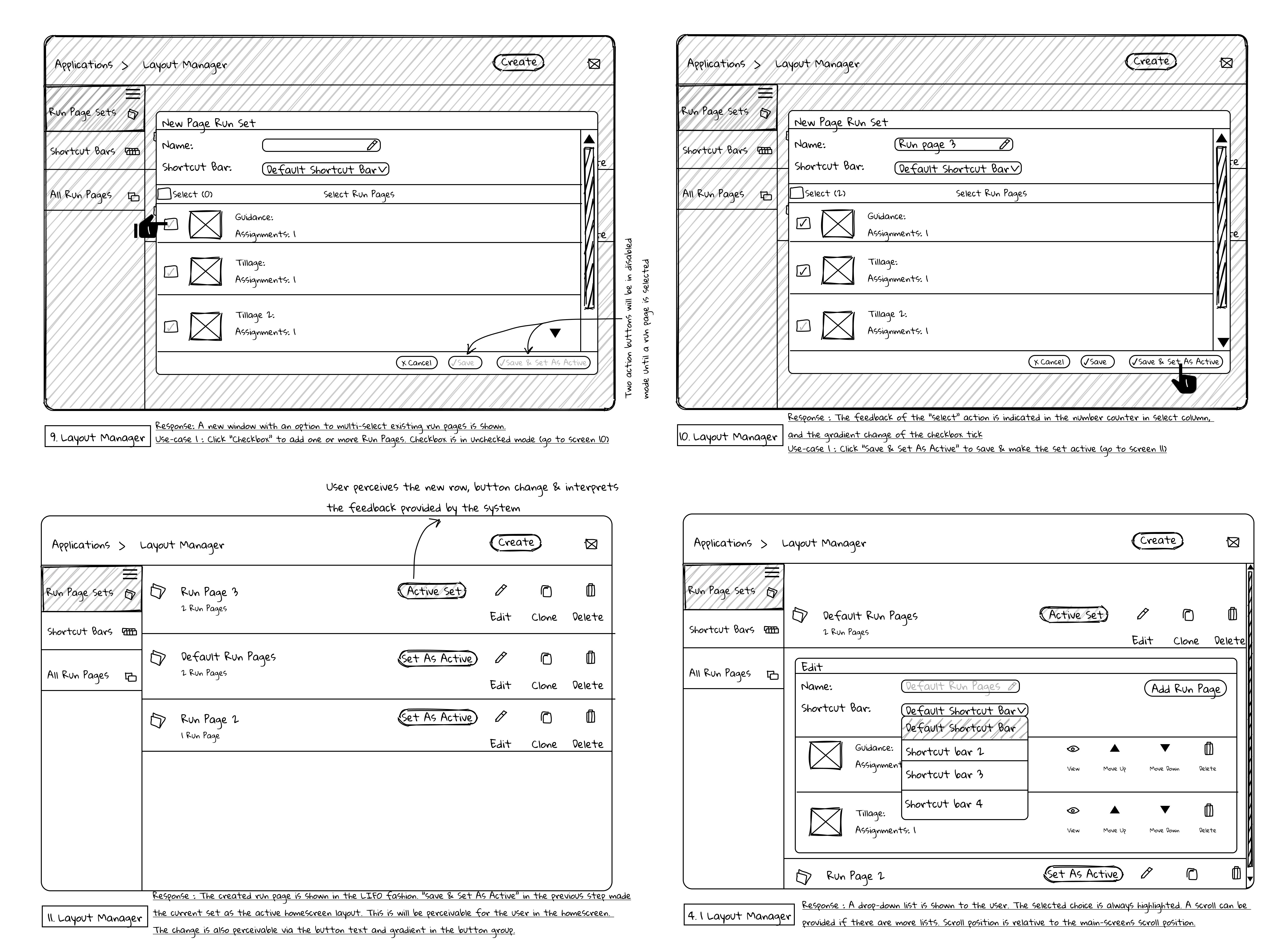
Adding widgets to the homepage
Heuristic Evaluation
A heuristic evaluation was conducted by usability experts (peers) based on the following principles:
Readability - Ensuring text is clear and easy to read, enhancing the user's understanding
Learnability - Designing the system so that new users can quickly grasp how to use it
Minimizing memory load - Reducing the amount of information
Prevent Errors - Minimize the likelihood of user errors
Consistency - Uniformity and Predictability across the interface
We made changes to the workflow based on the usability issues severity scale, adapted from Chauncey Wilson (1999).
Prototype
Here is a video-walkthrough of the high-fidelity prototype. The tasks include setting up the homepage interface [timestamp: 0:00] and redesigned Help Center [timestamp: 0:59].
What we did
Click count reduced from 15 to 5 for improved efficiency
Implemented clear and meaningful labels for buttons
An option to select multiple pages for the homepage simultaneously
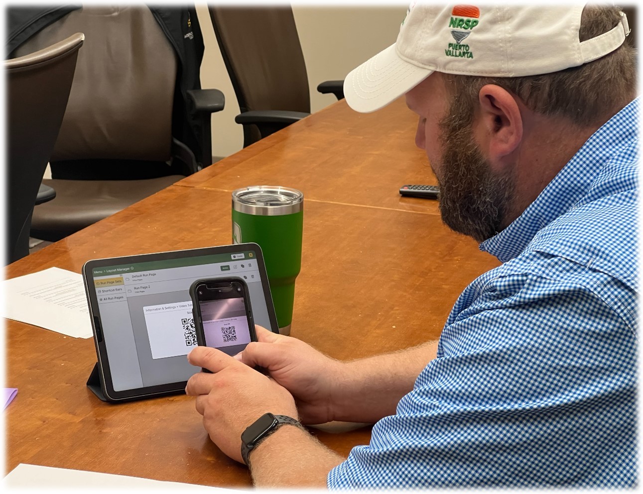
QR code linking to video tutorials in the help menu
A brief animation demonstrating functions in the help menu, available offline in the field
Putting Our Participants to the Test
Metrics
Moderated testing was conducted with all participants. Participant actions on the interface were screen-recorded for post-analysis. The metrics measured included user satisfaction, frustration, task workload, time completion, number of clicks, number of page navigation.
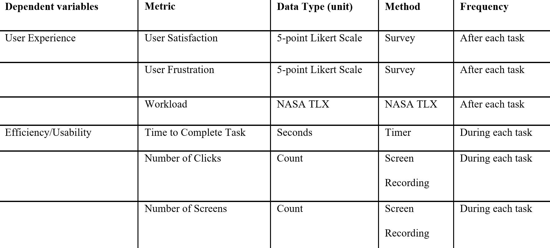
A follow-up interview and survey, using the NASA Task Load Index, were conducted with the participants.
Results

A t-test was conducted to compare task workload metrics (based on NASA-TLX) between the existing system and the proposed prototype.
We found the following metrics for the homepage interface:
41% decrease in mental demand to complete a task
44% decrease in time-based pressure to complete a task
50% decrease in effort required
Participants reported an 18% increase in satisfaction
We found the following metrics for the help menu:
64% decrease in mental demand to complete a task
64% decrease in time-based pressure to complete a task
87% decrease in effort required
Participants reported an 117% increase in satisfaction
What I Learned
"I was able to setup the dashboard without clicking many buttons”
"Help video is nice-to-have if I want to perform my functions while watching the steps"

The participants generally reported delight and satisfaction after testing the prototype. A more rigorous testing is needed with a larger number of participants to achieve higher statistical power. Since the integrated display is a touchscreen, it's crucial to assess accessibility under different field and lighting conditions, with participants who have varying physical abilities. Participants also desired bigger buttons.
The interface was tested on an iPad in a controlled environment, so the findings may differ from those observed in a study conducted in an agricultural field.
Future Directions
In the future, we hope to extend the study to include more use cases, different types of farming machines, and suggest targeted design improvements.